Thursday, September 15, 2011

HotelPro

Here is my final website for my e learning class.
I tried to work with a color scheme I have not used before. The website teaches 3 learning modules for hotel front desk agents. The modules are intro to hotel industry, check in and check out. Each learning module has a side navigation to let the user know which lesson they are on and gives the user the option to skip to different lessons. The top of each page lists which the user is on ex page 4 of 8. The user also has a next button at the bottom of each page.
The website also uses videos and voki's for learning.

Screenshots from this site.


Wednesday, September 14, 2011

Final

Here is my final website for Design for Dynamic Websites. This course is about We used MySql and PHP.
I use databases on 3 pages. Home page has a list of featured websites that comes from a database also on the wines page you can search wineries by type of wine and on tours page I have a list of wineries with the region they are located in.

Check out my pinterest boards for some inspiration 

Screenshots from my website

Monday, September 12, 2011

Color Schemes

I have a tendency to use the same color scheme on all my websites. I am trying to explore other possible color schemes I can use. Several color schemes made from pictures.

I also have great info about color for the web on pinterest 


Colors For the Web

Select an average of 3 different colors and use them consistently throughout the web site.Golden_Gate_Bridge_1

Chromatic harmony is one of the most important criteria in order to create a pleasant experience for the visitors. It is strongly recommended that a moderate number of colors should be employed; four or five is ok; more than that not only will they create inconsistency, by they will also cause an eye sore for the visitor making him skip important parts of the site.
Bay_Bridge_Dulled
How many colors

A site that uses fewer colors is easier to remember than a site that uses many colors. However, this doesn’t mean that you should always limit yourself to one color. Sometimes it’s good to pair your brand color with another color to make your website look and feel more vibrant.

Face_in_Stones
Where to apply colors

You may love your brand color, but that doesn’t mean you should apply it everywhere on your website. There are certain areas where your brand color works best. Interface controls such as navigations, menus, boxes, buttons, links and search fields are areas where you should apply your brand color. This highlights your interface controls, making them easy to see when users need to do a task.

The areas of your website where users read text should not only have high color contrast, but the colors you use should never compete with your brand color. Black and white are the best colors for this because together they make text easy to read and they’ll never compete with other colors. Black text on a white background is the standard convention for text on the web. It has never failed users before, and it won’t fail users now.
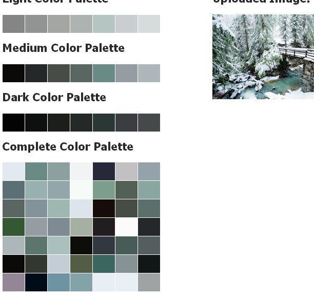
Rainy_Union_Square


Colour Contrast Check

Upload an image to generate a color palette based on the image's primary colors. Useful for quickly grabbing a particular color within an image for inspiration.

La_Cueva_de_NerjaMelissaniRaining_GoldLondon_LightTaxis_and_HatsJim_Beam_StreaksCrystal_Caves

Pile_of_EarthtonesRusted_Shells

Slice_o_Pie

English_Trifle

Strawberry_Chocolate

Chocolate_Cake

MATR

Great_Blue_HerronRobinBlueberriesFruit_and_Nuts

Blueberry_Explosion

Fort_Sumter

John_Day_Fossil_Beds

Gold_Fountain

Casa_Comalat

Window_to_Chihuly

Crumble_Brick

China_Town_Window

Intense_Windows

Evenin_Neighbor

After_the_Storm

Nighttime_DeliveryTerror_Vision_PosterStealth_ClownfishDracula_PosterFantastic_VoyageDest._Inner_SpaceBlack_Lagoon_PosterHonu_TurtleJaws_Movie_PosterPrimovula_UnderwaterManta_Ray_FlightHello_DolphinBalanced_breakfastTreasure_IslandMountain_SunriseEscondendo_o_TosoMorning_CoffeeSplash_Of_Grass

Storm_WashGreat_Ocean_RoadThrashing_Bull

Shutterside_Nook

Sunny_Showers

Key_Lime_Time

Face_in_StonesRocky_RedsDeserted_TreeSierra_NevadaAnza-Borrego

Spongebob_Balloon

Ask_Jeeves_Balloon

Blooming_Branches

Green_Wall

Sunset_Bees

Rain_Boot_Day

Welcome_Back

Rusted_ShellsPile_of_Earthtones

Airborne_MuseBrooklyn_Bridge_Dark